Interface Editor (.pgui)
The Interface Editor is a WYSIWYG GUI builder. You place widgets onto a live preview canvas, adjust their properties in a sidebar panel, and the result is the screen your users will see when the app reaches this GUI step in the workflow.
Opening the Editor
Double-click any .pgui file. To create a new one, run
Apleno: Create new Interface file from the Command Palette.
Editor Layout
The editor is divided into areas:
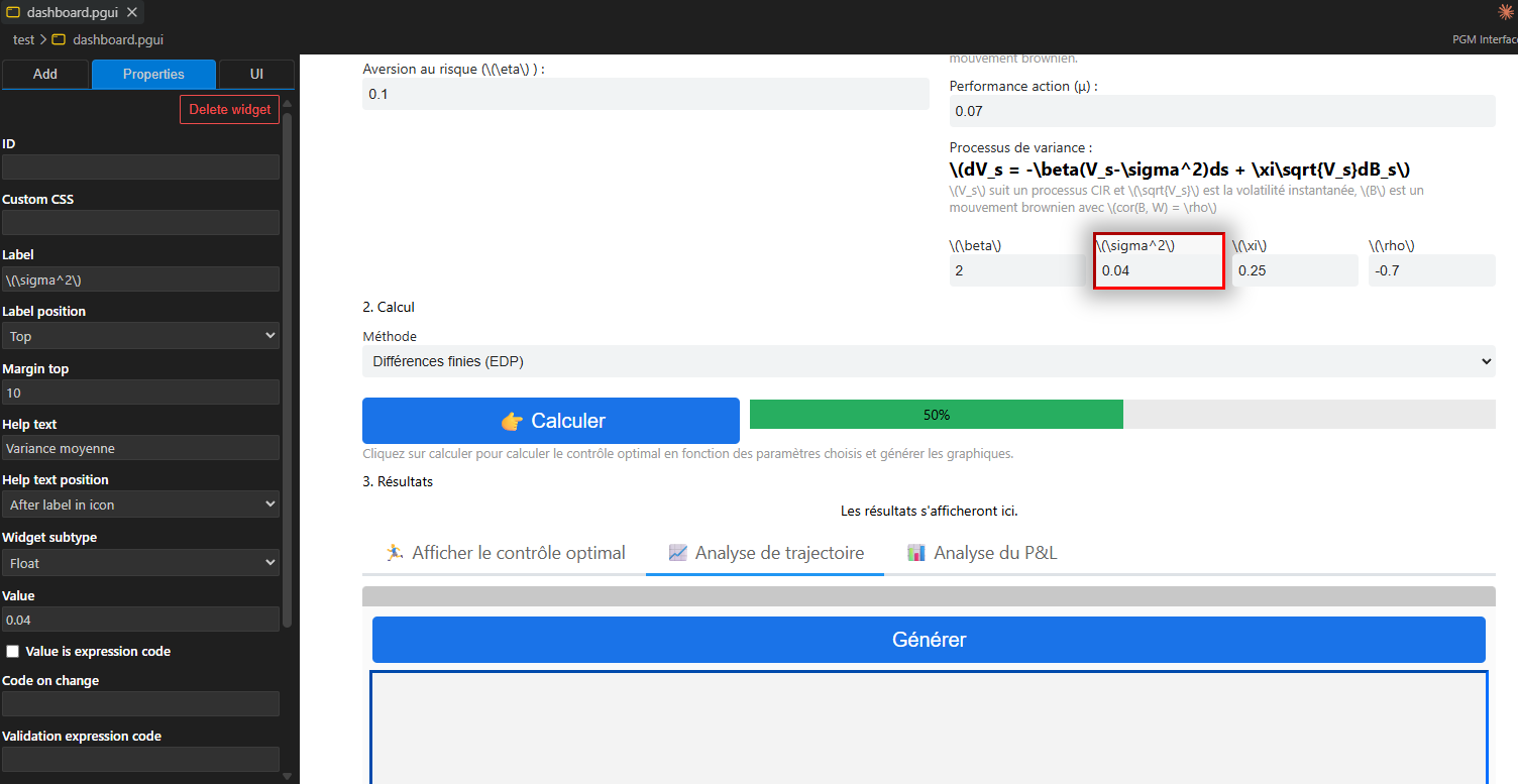
- Sidebar: Add tab: A list of all widget types, draggable or clickable to add to the canvas.
- Sidebar: Props tab: Properties of the currently selected widget.
- Sidebar: UI tab: Global interface settings (language, submit button).
- Live Preview: A real-time rendered preview of the interface. Click widgets here to select them.
Adding Widgets
There are two ways to add a widget:
- Click a widget button in the Add tab. The widget is appended at the bottom of the interface.
- Drag a widget button from the Add tab and drop it at a specific position in the live preview.
Widgets are grouped in the Add tab:
| Group | Widgets |
|---|---|
| Inputs | Text, Number, Path, Select, On/Off, Date |
| Display | Label, Image, iFrame, Table, Button, Graph, Progress |
| Layout | Box, Columns, Tabs |
| Special | Grid, Interval |
Selecting and Editing Widgets
Click any widget in the live preview to select it. The Props tab in the sidebar will display all configurable properties for that widget.
Changes in the property panel are reflected in the preview immediately.
To deselect, click on an empty area of the preview.
Deleting Widgets
Select a widget and either:
- Click the Delete button in the Props panel, or
- Press the Delete key while the widget is selected in the preview.
Moving Widgets
Widgets are rendered in a vertical stack. To reorder them, use drag-and-drop within the live preview (drag a widget above or below another).
For widgets inside layout containers (Box, Columns, Tabs), drag within the container.
Undo / Redo
The editor supports full undo and redo:
- Undo:
Ctrl+Z - Redo:
Ctrl+Shift+ZorCtrl+Y
Global Interface Settings (UI Tab)
The UI tab in the sidebar controls settings that apply to the whole interface:
| Setting | Options | Description |
|---|---|---|
| Default Language | R / Python |
The scripting language for code properties of widgets in this interface. |
| Submit Button | Visible / Hidden |
Whether a submit button is shown at the bottom of the interface. When hidden, GUI steps advance only when controlled programmatically. |
Widget Properties
Every widget has a Custom ID field at the top of the Props panel:
- Custom ID: a user-defined string identifier for this widget (e.g.
"username-input"). Used by your R/Python code to read and write the widget's value via the Apleno Designer API.
Custom IDs should be unique within an interface. If left blank, the widget will not create a variable in the language environment.
Common Properties
Most widgets share the following common properties:
Visibility & Layout
| Property | Description |
|---|---|
Margin Top |
Pixel space above the widget (default: 10). |
CSS |
A CSS class name or inline style string applied to the widget's wrapper. |
Label
| Property | Options | Description |
|---|---|---|
Label Text |
free text | Text shown as the widget's label. |
Label Position |
left, top, top (aligned), hidden |
Where the label appears relative to the widget. |
Help / Tooltip
| Property | Options | Description |
|---|---|---|
Help Text |
free text | Explanatory text shown near the widget. |
Help Position |
bottom, label |
Where the help text is displayed. |
Dynamic Values
Many widgets have a value property that can be:
- A static value (a string, number, etc.)
- Code: the result of evaluating R or Python code at runtime
If the Language toggle is enabled, the value field is treated as a code
expression evaluated each time the interface refreshes.
Input-specific Properties
Required validation
| Property | Description |
|---|---|
Is Required |
If checked, the user must fill in this widget before the form can be submitted. |
Event hooks
| Property | Description |
|---|---|
Code on Change |
R/Python code executed each time the widget's value changes. |
Condition on Submit |
An R/Python expression evaluated when the form is submitted. If it evaluates to false, the submission is blocked. |
Working with Layout Widgets
Layout widgets (Box, Columns, Tabs) are containers that hold other widgets.
Box
A simple container with an optional header and visual style. Drop any widget inside a Box to group them visually in a vertical layout.
Columns
Divides the interface into side-by-side columns. The Columns Widths editor in the Props panel lets you add, remove, and resize columns using a grid-unit system (the total of all column widths should be 12).
Tabs
Displays multiple panels of widgets selectable by tab buttons. The Tab Names editor in the Props panel lets you add, rename, and reorder tabs.
When editing a Tabs widget:
- Each tab is a separate Box widget that can contain any widgets.
- Only one tab is visible in the preview at a time; switch tabs by clicking the tab buttons in the preview.
- The Selected Tab property controls which tab is shown by default when the interface loads.
Nesting Widgets
Widgets can be nested inside containers to any depth, for example:
Tabs
  ├── Tab "Input"
  │     ├── Columns (2 columns)
  │     │     ├── Column 1 (Box): Text input, Number input
  │     │     └── Column 2 (Box): Select, Date
  │     └── Button "Submit"
  └── Tab "Results"
        └── Table
The Live Preview
The live preview is a sandboxed iframe that renders the interface exactly as it will appear at runtime. It responds to:
- Clicking to select widgets
- Reflecting property changes instantly
- Showing the correct layout, font sizes, colours, and widget states
Note: The preview shows a static rendering. Dynamic values (computed from R/Python code) will only execute when you run the actual app.
File Format
.pgui files are JSON. A minimal example:
{
  "version": 50000,
  "language": "r",
  "displaySubmitButton": true,
  "widgets": [
    {
      "id": 1,
      "customId": "username",
      "type": "text",
      "data": {
        "subType": "text",
        "value": "",
        "labelText": "Username",
        "labelPosition": "left",
        "isRequired": true,
        "marginTop": 10
      }
    },
    {
      "id": 2,
      "customId": "submit-btn",
      "type": "button",
      "data": {
        "value": "Submit",
        "buttonCode": "pgm.submit()",
        "buttonSize": "md",
        "buttonDesign": "primary",
        "marginTop": 10
      }
    }
  ]
}
Tips
- Give every interactive widget a Custom ID. This is how your R/Python code reads and writes values.
- Use Columns and Tabs to organise complex forms without making them feel overwhelming.
- Keep Submit Button hidden (
UItab) if you want full programmatic control over when the form advances. - Use the
conditionOnSubmitproperty on input widgets to enforce validation rules beyond simple "required" checks. - The
CSSproperty on any widget accepts a class name defined in your project's custom CSS, letting you fine-tune appearance per-widget.